Most of my drawings to date have been fairly straightforward to complete, including the finalized, digital images they ultimately become. Not counting any thought given to a design beforehand, usually I just sit down and work on a drawing–really figuring out then and there precisely what it is that I want to do–and, I complete it, sometimes trying out particular techniques along the way. Perhaps then I end up spending, say, three to five hours on a drawing, or maybe more if I have to work on it into a second day. Then I just have to scan it and crop the resulting digital image, after which I go about posting products and writing descriptions and such. (The latter of which, granted, can be a time-consuming and even tedious process.)
When I decided to design a playing card back though, things got substantially more difficult (particularly for a first time around with such a project), and I needed to rely a bit more both on my image editing program, GIMP, but also on my ability to think up alternate methods for achieving my objectives. Whether it was how to ensure symmetry across halves or how to draw such fine and finely detailed lines, or, simply confronting unforeseen issues, creating my Star Back Playing Cards became a really long, but instructive, experience.
Figuring Out the Design
I suppose I should begin with how I figured out what my design would be, since to look like a traditional playing card design, certain “rules” had to be observed, and this made the designing portion of the work itself harder than usual. I have collected playing cards in the past (just nothing, generally, that you could not buy in a store or online–nothing rare), so I was familiar with certain traditional card backs going in. (Indeed, my interest in cards was what led me to design my own card back to begin with.)
For instance, many of us are probably familiar with the classic Rider Back design of Bicycle® brand cards, and as it turns out, the United States Playing Card Company is behind many other brands and designs as well, such as Hoyle®, Bee®, Aviator®, Streamline®, and Tally-Ho® (Circle Backs and Fan Backs). (Bicycles® in particular have featured and continue to feature designs other than the Rider Back as well, such as the Cupid Back and, of course, the Leaf Back.)
There are a handful of observations to be made about these designs. While some (like Bee®) are simple patterns, most are fairly intricate. They are often symmetrical about the center (that is, across the horizontal and vertical halves), or at the very least across the diagonals, and, along with lines and curves, they usually feature some particular shape or figure. (For instance, the Rider Backs have a cupid riding a bike; Leaf Backs have leaves; the Hoyle® Shell Backs have shells and merpeople; and so on.) Also, they are typically done in white against the red, blue, or other color of the card back itself, often leaving an inner border of this color as well.
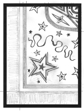
Taking all this into consideration, it finally occurred to me that I have never seen a card back featuring stars, seemingly a natural choice though, and so stars seemed to be a fitting element to use. I soon decided that I wanted prominent ones to be placed in the four corners (each with extra flourishes about it), and that I wanted stars of various smaller sizes to be placed elsewhere, particularly around the main ones and around the center. And as for the center, I ended up considering an oval shape to contrast with the rectangular shape of the cards, which eventually came to house “diamond stars”, including one at the very center, plus, to add some intricacy, triangles drawn close together. (The center actually resembles an eye to me now, although this was not my intention when designing it; I was still thinking more of diamonds.)
Further, I kind of wanted something to separate the stars around the center from the stars around the corners, which eventually became ribbons. Lastly, even after all that, it seemed to me that there was not enough “filling” in the design, and yet I did not want to add so much stuff that any semblance of a pattern would become obscured. As such, after adding a few more of the smallest stars, some dots, and six bars to help accentuate the division between the center and its stars versus those beyond, I felt at last that, after days of contemplation, I had a design I was happy with … a design that would make a nice card back.
Drawing Considerations
Knowing what I wanted design though was only the beginning, because there were already some issues that I knew I would have to overcome. One was simply how to ensure symmetry. Although my works are hand-drawn, still, for a playing card, people do not want cards that are asymmetric (unless, of course, the cards in question feature a photo or image that is inherently asymmetrical). Another was how I was going to draw such small and detailed lines, especially given that colored pencils can generally only be sharpened so finely.
Yet another was how I was going to draw stuff so small and detailed, possibly even re-positioning things along the way, whereas colored pencils are generally not erasable (some are specifically created to be erasable, but most, including my current ones, are not). Lastly, I also had to contend with how, exactly, I was going to draw something in white when in fact, I draw on white paper, as well as how I was going to re-produce the drawing in more than one color (for a red deck, a blue deck, and perhaps even more). I could have drawn “around” the design instead of the design itself (leaving white from the paper), all from scratch, but even if I could have succeeded with that for one color, replicating it for several would have been extremely difficult.
Well, the first two issues were actually pretty easy to solve. Although I generally only use GIMP for things like cropping and adding transparency (which is to say, I really do keep my work primarily physical, without much digital help), still, it occurred to me that I could draw a large version of just one quarter of the design, which I could then shrink down and assemble in quarters. This solved my first two issues quite well, because the larger drawing area would make it easier to draw what would become small, detailed lines, while planning to assemble four of the same quarter would ensure symmetry.
As for the latter issues, they were a bit more troubling (and, I think, wondering how I might handle them kept me from starting serious work on the drawing days and even weeks before, making me question whether the whole thing was even feasible). I finally had an idea though, which was that I would first draw the white of the design in graphite, and then, I would use that initial drawing to trace out the complete design for filling, with different colors, on separate sheets. This seemed like a good solution because graphite, of course, is largely erasable, not to mention that by tracing a base design, re-productions of that design would have had consistency.
Unforeseen Complications
So I began drawing the design, just one quarter of it except enlarged, and it generally went well. I had sat down, looked at Zazzle’s sizing guidelines, and figured out precisely what size to make my drawing template (that is, the bordered area on a sheet that would contain the drawing), such that it would be sized right for proper fitting on the cards later on. (I even did some tests by uploading sample images to Zazzle, and I settled on making the quarter four times larger than what it would ultimately be.)
My initial “Star Back” drawing, without the bars, dots, and a few stars.
© 2015 Darren Olsen
But all did not proceed smoothly. For one thing, while I knew going in that I would have to be comfortable drawing something that was going to get shrunken down by a factor of four, still, actually doing it was a little tricky. I had to really keep track of how everything would be proportioned, including how thick lines and such would ultimately be. Further, I soon found that drawing the stars and such in the larger sizes was very difficult, in terms of keeping them well-shaped. So, I ended up printing digital stars in the various sizes that I could then themselves trace, which worked very well once I resorted to it.
Most seriously by far though, was that once I completed the design in graphite and tried tracing out one of the final versions, I just could not see the pattern well enough through the second sheet of paper to accurately trace it. (My attempt at doing so, so far as I went with it, was actually not all that bad; it was just not quite as good as I felt I needed.) Perhaps only slightly better, I also soon found that even with the enlarged size, some of the areas that I had to fill with color were still just too small to accurately work in. Hence this soon became another point during the process at which I questioned if, after all, I could even complete the project.

The full design, scanned in black and white. Without zooming in, it looks better than it really is.
© 2015 Darren Olsen
I soon had a another idea though which, in light of my experience and after searching for more information on using GIMP, I felt would work. I would simply scan my graphite drawing as a black-and-white image and then print it back out for filling with color, after which I would again scan it, except only this second time, after scanning, I would use GIMP to replace the black with white! (GIMP, it turns out, has many options for swapping one color for another, including its standard “fill” tool plus, for instance, an actual “color exchange” option.) Everything would still be hand-drawn, but, rather than tracing out the base design first, with help from GIMP, I would instead proceed immediately to filling, now with the design itself in black, black that I would ultimately switch out for white.

The base version: cleaned up, tweaked, and ready for hand-filling.
© 2015 Darren Olsen
Alas, even this had some unforeseen complications, but thankfully nothing that could not be beaten with some tedious work. For one thing, partly because even graphite does not thoroughly erase, the black-and-white scan still had some black in places that needed to be all white. So, substantially zoomed-in, I had to “clean up” the image before it was suitable for filling. (This, naturally, was an extremely tedious task, including staring at the computer screen for hours on end, gradually working through the entire image. I did do a little tweaking here as well, polishing up what I had done by hand.)

The base, filled with red.
© 2015 Darren Olsen
Then, after filling in each sheet (I ultimately did four colors for the decks), I found that in swapping the black for white, I had to be careful of what “threshold” setting I was using for the swap. Too low, and some of the black would remain, and yet if I went too high, some of the color would get stripped out. (When filling, I had tried to avoid coloring over the black, but some was inevitable; either for this or because, maybe, printers only print “sufficiently-deep” black–I do not know if this is the case or not, though it seems plausible–some of the “black” pixels in the scans with color were actually a bit too light, thereby complicating the color swap. I ended up filling each and every part separately so as to leave pixels in the interiors alone, but still, I did not want color stripped out at all, from anywhere.) And actually, I also found that very close to borders, my colored pencils had apparently dislodged bits of the printer ink into the colors, which, for one very light color in particular, left occasional dark spots where there should have simply been light color.

A completed quarter in red.
© 2015 Darren Olsen
Ultimately though, yet again, I just had to do some tedious clean-up on the scans–tailored to each particular color–including erasing excessive, lingering “black” from all of them (one particularly more so than the others), and for one, even patching up darkened spots within the color itself. At last then, after a lot of contemplation, problem-solving, and simple effort, once I filled in my base design with the various colors I chose, I soon had my completed card backs. (To assemble them in GIMP, I copied and four times pasted each cropped quarter as what GIMP calls “layers”–think of, physically, cut-out bits of paper all sitting on a full sheet, or even on each other–and then positioned and flipped them as appropriate for each back.)

“Star Back” – Red
© 2015 Darren Olsen
Finishing Up
As you might imagine then, getting from the initial conception to my finalized Star Back Playing Cards was really quite an exercise. I wondered at times whether it was even feasible, but I really imagined that it would turn out pretty cool, if only I could get it done somehow. So, I stuck with it; learned some new, helpful things about GIMP; and simply gained some interesting and useful experience. While I do hope to return to simpler projects, I am excited to finally have my cards completed, and, I am glad indeed that I worked to see them become a reality.
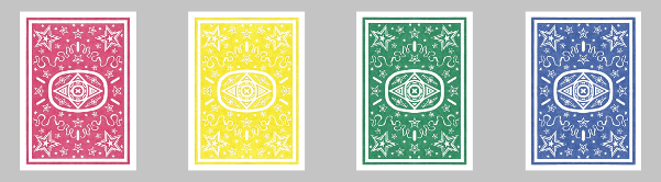
Star Back Playing Cards Set
© 2015 Darren Olsen
