When I create artwork to be placed on Zazzle products, usually it is simply that: I draw a picture, scan it, tweak it ever-so-slightly, and begin placing it on a range of products. When I came up with the idea of Ms. Deal though, it all became a true project, with evolving concepts and multiple parts required for completion. What started as an idea for a can / bottle cooler only, eventually became several distinct drawings, mixed-and-matched on a small collection of products, and even a “backstory” for the products in question! Even my Star Back Playing Cards Set, which took a lot of thought and effort to bring to completion, was not nearly as expansive as the Ms. Deal project.

“Ms. Deal” – Assembled
© 2016 Darren Olsen
The Idea
Although it has long been argued that successfully selling on Zazzle requires, among other things, placing a given image on multiple products, more recently, Zazzle proper has advised against this, arguing in favor of singularly unique products instead. That is, creating images that are specially tailored to one product only, and then only placing such images on one product apiece. Personally, unless an image simply does not look right on a given product, I do not see why a given image should be restricted to one product only, and so I still create multiple products per drawing.
Nonetheless, this all got me thinking about creating more singular products for my “Few of a Kinds” category, and about three months ago, the notion of a can / bottle cooler, representing a vintage soda that never was, came to mind. As I worked on my other two most recent drawings, I considered this idea off-and-on, and by the end of September or so, I had decided to go forward with it.
I have always found the early history of soda to be interesting, which is probably why I envisioned a vintage soda design for my prospective can / bottle cooler. I also have an appreciation for the advancement of women’s rights over the past several decades, which is probably why I began to think about how Dr. Pepper and Mr. Pibb and such are all, presumably, named after men. And so for the design of my can / bottle cooler, I decided on a soda that was named for a woman. Early on, this was my only real thought, aside of course from the actual design.
Then things became steadily more complicated. For one thing, it soon became apparent that a properly-fitting drawing for the bottle cooler would not be properly-fitting on the can cooler, and so I would have to post the two products separately. (By default, can or bottle cooler are style options for one single product.) More significantly, as I looked up old vintage soda bottle labels and logos for inspiration, I soon learned that old sodas usually had various other products associated with them, such as clocks, serving trays, and coolers.
Some of these items, like thermometers and syrup dispensers, Zazzle does not have, but for those it does, I began to feel like I had to include them in my project. Yet I knew any design I might draw for the can and bottle coolers would never suffice for items with larger design areas (not to mention items that by their very nature always had a little more to them than mere labels did). Consequently, I ended up drawing additional images or else digitally modifying existing ones, as needed, for the various products I worked on. This was pretty much a first for me, as previously, at best I either created two related images for a set (see for instance my Festive Days and Jubilant Nights Festivity Set), or else the same image in a limited number of different colors (for instance my Star Back Playing Cards Set). Most of the time, like I said, I simply draw one single image to go on several products.
And then came the backstory. I knew early on that I would be “creating” a vintage soda named for a woman, and I could have left it at that. But I began to feel more and more like having some fictional history to go with this fictional soda would really enhance the whole thing. As I thought about it and began to create the most basic of backstories, by mid-October, I felt compelled to go all the way with it: to write a lengthy story based on my own ideas and sentiments, as well as the history of soda, women’s rights, and the 20th century in general.
Drawings and Designs
Early on, I had settled on a combination of pink, green, and purple for the logo / label. I like those colors in combination, but also, while I wanted the design to seem a little feminine, I did not want it to feel exclusively feminine. With pink as in light red, and purple as in violet, combined with green, I felt I could achieve the objective.
As for the name of this fictional soda, that was a bit tougher. Very early on, before I had settled on naming it after a woman, I had a choice of any number of names, though I focused on ones suggestive of power and pep. (After all, even today many sodas contain caffeine, as soda has long been viewed as a pick-me-up.) Later, while I retained these notions for the slogans (“Step It Up!”, “Do More!”, “Achieve!”), in the vein of Dr. Pepper and Mr. Pibb, I decided on a “Ms. SOMETHING” for the name. Further thinking of the hardships women have faced in gaining better standing in society, of having to deal with lots of things, I figured, why not “Ms. Deal”? Even more to the point, a basic notion of equality is that women, like men, can deal in and handle anything they choose to, so this lent even further meaning to Ms. Deal–not just for women, but for all of us. (This then left only the spelling. I considered various alternates, like “Deale”, “Diehl”, and so on, but eventually concluded that plain and simple “Deal” was best.)
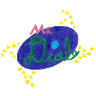
And so it was time for the core drawing, the logo / label that would go on the can and bottle coolers:

The original, core Ms. Deal drawing.
© 2016 Darren Olsen
Trying to keep it vintage, I looked up several collectable soda bottles from before 1940 or so. While it was apparent that not all early logos and designs were “simple”, many were indeed pretty straightforward in their appearance. I began to see a simple purple oval, with “Ms. Deal” written on it, one word being in pink, the other in green. To spice it up just a bit, I experimented with tilted ovals from my word processor, and considered letting some part of “Ms.” and some part of “Deal” extend to just beyond the oval. Settling which word would be which color was a bit of a challenge. I might have preferred for “Ms.” not to be the one in pink, given the broader appeal I envisioned Ms. Deal having, but I also really preferred green amidst the purple, which required “Deal” to be green.
Of course, I realized that the label image really needed to be a bit taller than wide, and that this would require a bit more design above and below what I had already planned. I began to think, what if the Ms. Deal logo was representative of advancement, of moving forward in various ways? So what if it had yellow stars, curved in such a way as to be suggestive of the whole logo spinning? Add to that some simple cyan-blue bars, offset to suggest everything else moving right and upwards, and somehow, it seemed perfect.

The background for “Ms. Deal” images.
© 2016 Darren Olsen
Lastly, as I will get into in more detail in the next section, whereas the bottle cooler seemed okay with a simple background color on Zazzle itself, for the can cooler, I really felt that a proper background was warranted. (Based on what I had been seeing of vintage cans.) Still trying to keep with vintage-looking colors, I soon settled on a cyan-green, or aqua color. But since I did not want this color for the bottle cooler, this aqua background in fact became the second drawing I did for the Ms. Deal project, available for whatever products I felt it would look good on.
The simplified Ms. Deal “logo”.
© 2016 Darren Olsen.
From there, as I decided on a few additional products, it was just a matter of a few additional drawings, or else digital modifications of existing ones. Probably the earliest was the bare-bones “Logo”, in which I used GIMP to erase the stars and bars from the core image. (I initially wanted this for the bottle cooler, to go up on the neck of the bottle.) Another was the “Ring”, which I originally envisioned for a clock. (I wanted the clock’s numbers to be against a distinct border that encircled everything else.) I initially meant to draw it in a slightly more magenta-ish pink only, but ended up using a peach color as well, to add a little more richness:

The Ms. Deal “ring”, initially drawn for a clock.
© 2016 Darren Olsen
Then came the “Full” image, for which I used GIMP to expand the core image by duplicating the stars and bars, not just above and below, but to the left and right as well. (This too was initially just for the clock, as it had room for an image that was both tall and wide.) It soon became my favored form wherever feasible, however, as it enhanced the whole “climbing upwards and going forward” sense of the image:

The “full” version of the Ms. Deal drawing.
© 2016 Darren Olsen

The decorative Ms. Deal “left frill”.
© 2016 Darren Olsen

The decorative Ms. Deal “right frill”.
© 2016 Darren Olsen

Just some stars and a bar in isolation, with a downward flow from left to right.
© 2016 Darren Olsen

And now with an upward flow from left to right.
© 2016 Darren Olsen
Lastly, for products that could accommodate wider-than-tall images, I came up with what I called the “left frill” and “right frill”, which are just some very thin and tall sets of decorative lines, really. (They could fill up any excessive horizontal space that remained after placing the core or full image.) For products with lots and lots of space to fill, I also used GIMP to create lone horizontal bars except with stars both to the left and right. And, for products with very small design areas that I nonetheless wanted to fill with just a bit more than the bare logo, I further used GIMP to erase the bars from the full image, leaving just the logo with the four sets of stars:
The Ms. Deal logo with the full version’s stars.
© 2016 Darren Olsen
Products and Designs
Then came the really fun, though at times tedious part: selecting and combining from among the various images to create each individual product. (Though of course, designing the products typically happened concurrently with coming up with the new images, as I kept seeing what else was warranted.) Early on, like I said, I only intended to create a bottle cooler and a can cooler, and so with only the core image, I began researching and designing those. Since I was trying to maintain a vintage style, I did not have to concern myself with nutrition labels. (From my research, it seems that sufficiently-old cans and bottles only mention ingredients if the companies behind them wanted to advertise said ingredients.) I also chose to avoid using the trademark symbol anywhere, since I obviously was not using and in fact had no registered trademark.
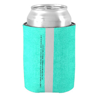
But, as I soon found out, I did need to include the city and state of origin (but not zip codes, which did not exist until later), because nearly all vintage cans and bottles give this information. Pertinent to the backstory I was developing, keeping in mind that soda did not start coming in cans until the ’40s, I figured that the bottles would be bottled and presumably distributed by one single company, Fallow Brew Works, in Seneca Falls, New York, starting in 1915. (The city in which the first women’s rights convention was held.) Then the cans, which would have obviously been a later creation, say beginning in 1941, would have been canned there too, except now under the authority of a spin-off company, the Fallow Pop Co., in Rochester, New York (the location of Susan B. Anthony’s house, someone who did far more both for women’s and civil rights than many people realize). Although there are naturally several cities that are significant in women’s history, going with these two “big” ones just seemed right. (And as for Fallow Brew Works and the Fallow Pop Co., I will explain these names once I start talking more about the backstory.)
And thus, adding a few slogans and settling on the “right” fonts in Zazzle, here are the “Bottles and Cans of Ms. Deal Soda”:
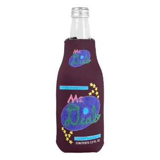
Bottle of Ms. Deal Soda (Bottle Cooler)
© 2016 Darren Olsen
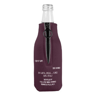
Bottle of Ms. Deal Soda (Bottle Cooler) – Reverse Side
© 2016 Darren Olsen
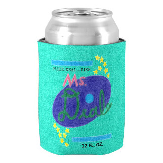
Can of Ms. Deal Soda (Can Cooler)
© 2016 Darren Olsen
Can of Ms. Deal Soda (Can Cooler) – Reverse Side
© 2016 Darren Olsen
Since it seemed from my research that cans rarely had unprinted areas (except for a little strip on the back), I used the background for the can cooler, whereas for the bottle cooler, I used a background color on Zazzle to simulate Ms. Deal soda showing through the clear “glass”. And in fact, since the “bottles” were imagined to be from an earlier time, I further felt that the lack of background on the bottle cooler would speak to a slight evolution in branding, as would the lack of as many slogans on the can cooler. Then, when Zazzle coincidentally launched bottle labels just shortly before I completed the whole project, these bottle labels gave me an opportunity to do a Ms. Deal “bottle” that was presumably somewhere in-between the original bottles and the later cans:
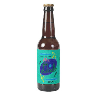
Bottle of Ms. Deal Soda (Bottle Label)
© 2016 Darren Olsen
From there, I began working on the clock, serving tray, and coolers, all items that vintage sodas typically had. The tray was probably the easiest to work with, with the clock being a tad more troublesome and the coolers downright aggravating.
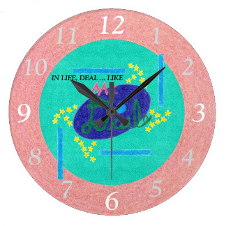
Ms. Deal Soda Branded Clock
© 2016 Darren Olsen
Of course, it was during this time as well that I began creating the additional images. The clock motivated both the “ring” and “full” images, but while it was not difficult to combine everything, the numbers were tricky. Zazzle does not provide a template for placing clock numbers (partly why I have never put numbers on my clocks, other than that I feel numbers are not really needed), so getting them aligned was an up-front challenge. Although I briefly explored whether I could just use Zazzle’s image-movement tool to shift each number appropriately into place, I soon determined this would not work (although I did later use Zazzle’s image-alignment tool for extra precision), and so under advice from other Zazzlers, I ended up using my word processor to create a regular 12-sided polygon, which I then uploaded and used as a template. (I also chose to emphasize the “12”, “3”, “6”, and “9” a bit, by making them slightly larger and pure white.)
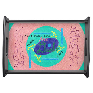
Ms. Deal Soda Branded Serving Tray
© 2016 Darren Olsen
The tray was next, and other than motivating the “frills”, it was not terribly difficult to design. I did go back-and-forth a bit though on how to place the ring, if at all even. Originally I think I was expanding it so much that it really only added a little color to the sides, leaving the frills partly over the aqua background. But I did not really like the frills in this way, so I continued to work with it until I eventually had the ring shrunk down and the frills fully upon it, with the full image overlapping the ring a bit too.
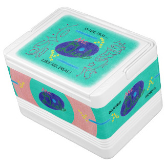
Ms. Deal Soda 12-Can Branded Igloo Cooler
© 2016 Darren Olsen
Like I said though, the coolers were pretty aggravating to work on, ultimately. Not that the results were not worth it; I am glad I stuck with them. The thing about designing on coolers is though, while the tops are easy enough to arrange images on, the other design area is the “wrap”, which is all four of the sides in one long strip. Well, when you cannot work on each side individually, you cannot, for instance, center an image on a given side. So if you aim to design each side separately from the rest, well, you better watch very, very closely, to try and get your images aligned and centered correctly. Ultimately, what it comes down to is clicking-and-dragging to visually center images, or else using the image-movement tool to move images or text to precisely the right spots–first moving groups of images to the same exact spot, and then separating them by precisely-opposing moves.
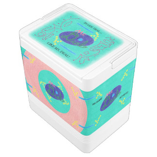
Ms. Deal Soda 24-Can Branded Igloo Cooler
© 2016 Darren Olsen
But then to top if off, by default each cooler is available in either 12- or 24-can size, except the latter offers more design space, and, worse, for whatever reason, it seems that images can get slightly out of alignment when switching from the 12-can to the 24-can. In other words, for the best possible design on each size, it is really necessary to design them separately. Like I said though, the results were worth it. I created the lone stars and bar images for the coolers, and while the 12-can could really only fit the bare logo and four bars, on the 24-can, I was able to “upgrade” to the logo with stars on two of the sides, plus a total of eight bars. Actually, now the coolers, along with the clock, are probably the two neatest-looking items in the whole set.
To complete the collection, I lastly designed the playing cards (generic and Bicycle®) and poker chips, plus the “sign” and shirt.
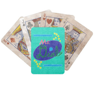
Ms. Deal Soda Branded Bicycle Cards
© 2016 Darren Olsen
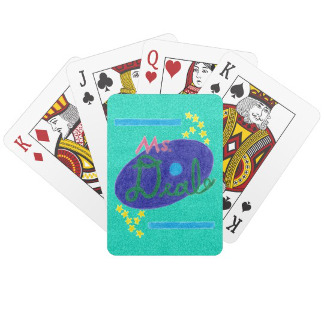
Ms. Deal Soda Branded Playing Cards
© 2016 Darren Olsen
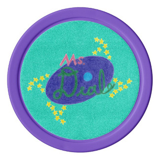
Ms. Deal Soda Branded Poker Chips
© 2016 Darren Olsen
While I am not certain that card decks and poker chips were ever standard with vintage sodas, I happen to like cards and even have a few decks that are branded with big name sodas, so the cards and chips seemed like a worthy addition. I chose to offer the Bicycle® cards in the “Distressed Edition” by default, the implication being that each deck is decades old, while for the poker chips, I settled on purple for the edge color after originally envisioning pink. (Pink was much more like the “ring”, obviously, though with the logo being purple, I eventually found myself favoring the purple.)

Ms. Deal Soda Sign (Poster)
© 2016 Darren Olsen
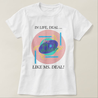
Ms. Deal Soda Branded Shirt
© 2016 Darren Olsen
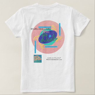
Ms. Deal Soda Branded Shirt – Reverse Side
© 2016 Darren Olsen
As for the “sign” and shirt, soda signs were eminently popular, which I hope the poster is a suitable approximation for. And while I have never posted any shirts before (I just feel that my drawings are not suited to shirts), again, for modern-day branded merchandise at least, a t-shirt just feels like a must. I struggled a bit to settle on the front versus the back, and whether and how to include my own branding information. Ultimately, I more-or-less duplicated the front on the back, though I adjusted the slogan so as to fit my logo, store, and website information at the bottom. (Incidentally, customers are free to remove my branding information, though of course I hope people might choose to leave it on.)
“Remembering Ms. Deal” … Or, the Backstory
Even as I finished up more and more products though, I had one other very big thing to complete. Early on, like I said, my only thought was that Ms. Deal was a vintage soda that had been named after a woman. And as I contemplated the project a bit more, I think for awhile, I was envisioning Ms. Deal soda as having been from an alternate history of sorts, a history in which gender equality had long been the norm. But more and more, I began to wonder how Ms. Deal could have actually been as an old vintage soda, and by mid-October, I was actively working on a lengthy backstory.
“Remembering Ms. Deal“, as I ultimately called it, became a bit more than just a backstory, I suppose. Although I never really intended for it to carry a moral, as I dreamed up the story of Patty Fallow, a.k.a. Ms. Deal, I found himself imagining a life worth admiring, and one that was not really beyond an “everyday” life that any one of us might lead. And it became my hope that if nothing else, someone who reads “Remembering Ms. Deal” might get a good feeling by the time they finish it, even if it is not exactly the best biographical and historical fiction around. (I am not experienced in writing fiction.)
To be sure, I wanted it to augment the whole project, and to enrich the “Ms. Deal Progressive Nostalgia Soda Set” at my Zazzle store in particular. An early consideration was whether I wanted “Ms. Deal” to have been heavily involved in the women’s rights movement, or else just an “average” woman who ended up creating and selling a soda. Well, given that the majority of us are not activists for women’s rights or gender equality by profession, I mostly went with the latter option, though I did make references or pay homages to significant dates, events, and people in women’s history. (Seneca Falls and Rochester as the main cities in the story; congressmen drinking the soda while debating and approving the suffrage amendment; “Ms. Deal” ultimately taking up advocacy against restrictive roles for women, as Betty Friedan and The Feminine Mystique later would.) For that matter, I also ensured that “Ms. Deal” had an impact on significant events of the 20th century in general, including helping people during the Great Depression and the Second World War. (But was it over-the-top and perhaps insensitive to tie in Ms. Deal with the Holocaust even, however lightly?)
As for particulars, I knew from very early on that Patty had created her soda as a child, in her family’s drugstore, under special inspiration from Dr. Pepper. From there, between checking dates, keeping cultural customs in mind, and adding in certain life events like marriage, deaths, children, and illness, it was fairly straightforward to craft the first half of the story. Of course, I had to set up Fallow Brew Works and the Fallow Pop Co. for success that nonetheless never went too far, and as for how Patty could have even started the business to begin with, I just figured that her new husband offered both the money and the support and approval that she needed. And really, given how significant the world wars were in getting women working beyond the home, I think the notion that the soda was originally marketed to and found success among newly-working women was rather plausible, as was the severe setback from the Great Depression. And then it was here that Patty began taking on her volunteer and service work, culminating with an early advocacy against restrictive roles for women.
But by now, it may be apparent that there is a bit of a tension regarding naming in “Remembering Ms. Deal”. Despite the prominence of “Ms. Deal”, the woman in the story is named Patty Fallow (later Patty Keller); her companies likewise both carry the Fallow name; and the soda is first called Patty’s Sweet Soda Pop, and then Miss Fallow! The fact is, I had decided on the name “Ms. Deal” very early on, and back then, as I was still vaguely thinking of the soda as being part of an alternate history of sorts, this presented no issue. Later though, once I was creating a historically-accurate backstory, well, “Ms.” just was not in use during the late 1800s and early-to-mid 1900s. (Although much to my surprise, I recently found out that it actually did already exist as a term of address for a woman, one that ignored marital status like it does today.) As such, I had to rely on a different name in the story, although the epilogue does indeed officially account for the name “Ms. Deal”, and makes it prominent and important even. (As for the products themselves, they are done in a vintage style but, yes, in the name, they carry a touch of modernity. I am happy with that, and really could not imagine it being any other way now.)
Finally, I should mention that “Fallow” turned out to be a pretty significant name in and of itself. As to how I came up with it, I had been reading about different waxes that candles can be made out of, one of which is tallow, or animal fat. I liked how tallow sounded, and so came up with the variant Fallow. But once the whole project was completed, I happened to look up “Fallow”, and according to The Internet Surname Database, Fallow in fact derives from Olde and Middle English words and refers to “a dweller by the newly cultivated land”. Well, given that Patty Fallow lived and worked while the foundation for modern gender equality was being set, she did indeed “dwell by the newly cultivated land”, if you think about it a little metaphorically, right? I was extremely pleased to discover that the name “Fallow” carries such meaning, particularly since I was unaware of it during the writing and completion of the whole project.
The Future
One drawing that became several … twelve unique products that mixed-and-matched said drawings … and a backstory that can even stand on its own. The Ms. Deal project was indeed a true project, and despite all the time it took to complete, I am happy to have added it to my work for The Draw. As to whether I will ever undertake such a project again, I cannot say, though it was certainly a new and informative experience.
And what is interesting is, I cannot say for sure either whether Ms. Deal is definitely finished. I can say that if Zazzle ever adds a wall thermometer to its product offerings, so long as it is anything at all like the thermometers that vintage sodas had, then I will definitely add a Ms. Deal Soda Branded Wall Thermometer to the collection. And given that the Ms. Deal imagery could conceivably go on any number of other products, if a customer would ever want a Ms. Deal Soda Branded SOMETHING, I would probably create it for them, even if I chose not to make it publicly available. But as for variations on Ms. Deal soda (Cherry Ms. Deal?), or additional backstory or side stories … I tend to think not.
Either way, as Ms. Deal represents the best in all of us, I hope that we may all aspire to deal a little bit more like Ms. Deal. For indeed, as the most important of the Ms. Deal slogans goes: “In Life, Deal … Like Ms. Deal!”
