Kuumba, or … Creativity. The formal Principle states: “To do always as much as we can, in the way we can, in order to leave our community more beautiful and beneficial than we inherited it.” Clearly Kuumba means so, so much more than art and music or whatnot, or even the creative process that leads to such. It means nothing less than the making of all of life better–however this grand ideal may be achieved. It follows beautifully and rather meaningfully from the immediately preceding Principle (Nia, or Purpose); is backed by its successor (Imani, or Deep Faith); all three of which in turn rest on the foundation of the the first four (Umoja, Kujichagulia, Ujima, and Ujamaa–Unity, Self-Determination, Collective Work and Responsibility, and Cooperative Economics).
Yet there is no doubt that Kuumba is most often associated with creative and artistic endeavors; and, for good reason. Is art and culture not a significant part of who you are? Who a people are? Can the arts–music, film, art, whatnot–not convey the highest ideals of love and learning? Can they not soothe you during hard times; help connect you to others and to your culture; or remind you of what really matters, grounding you in a better reality? (Yes, I know a lot of art does not necessarily do all these things … and that is okay and even needed. Not everything worthwhile in life has to be of a profound nature. But art most certainly can do these things; and, sometimes, it does.) Moreover … is the creation of art not quite a process sometimes? With everything from inspiration to actual creation, to all the effort that may take, to finished work and shared enjoyment? A process that does sometimes leave life just a little more beautiful?
Logo for the Gather ‘Round Kwanzaa Creations Kit on Zazzle
© 2018 Darren Olsen
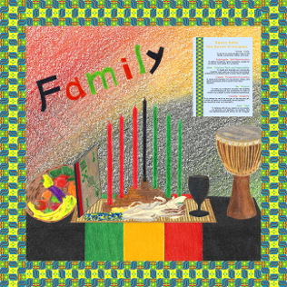
The Gather ‘Round Kwanzaa Creations Kit is the most complicated and drawn-out “project” I have yet done for The Draw. It took about four months from conception to completion–usually two-to-three hours a day–feeling at times as though the work involved was only growing. Yet while I am not of African descent, the Principles of Kwanzaa do speak even to me, at least a little … and not least of all Kuumba. While in deference to and respect for Kwanzaa and its non-commercial nature, I had long decided against doing a Kwanzaa drawing, the key there is “a” drawing–one lone drawing like any other, soon done and placed upon several products. When instead, I hit upon the notion of doing several drawings–pieces of innumerable unrealized drawings, really–whereby families and friends could gather at their computers and themselves create something truly special and unique–it was suddenly so much more workable. Hopefully, I could create something that would allow others–families, most of all–to truly create something unique and special for their Kwanzaa celebrations … and, of course, all while sharing time together, collectively creating!
Motivations and Conceptions
Well, I suppose I have already covered much of this. I do have some appreciation for the Principles of Kwanzaa and such, though I am not part of its culture or tradition; and by creating something that others could take up on and uniquely finish for themselves and their families, I embarked on crafting the Gather ‘Round Kwanzaa Creations Kit. Incidentally though, I like Kuumba in particular because of the whole notion of trying to make everything better; to create a better tomorrow. And like I said, that is the deeper ideal behind it … at least as I see it. In fact, there is a song that even equates it to “spirit power”; perhaps you might like to give it a listen:
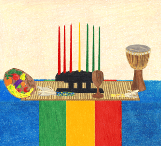
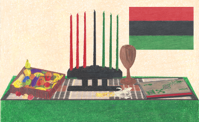
But as to what, precisely, the Kwanzaa Creations Kit was to be …. Naturally, my first thoughts were of a table setting (back before I had turned down doing the single drawing even). After all, the table setting with the seven symbols is such an integral and iconic part of Kwanzaa that I thought, I could draw at least a couple versions of each symbol, and then with a table and background, people could customize by crafting their own unique setting. Then, I think, the idea of doing a few different backgrounds came to mind–from a wall to a Kente pattern, and to an mkeka and even (eventually) an abstract drawing in the Pan-African colors. So, it was to be a table and three or so backgrounds, plus two or three versions each of the seven+ symbols (there are two supplementary symbols to the seven, for a total of nine altogether).

“Kente Pattern v1”
As I wanted the Kit to be as customizable as feasible (after all, that was the whole idea), I also began thinking of what else the backgrounds could be used for. One was easy: the Kente pattern. Early on I thought of doing an original Kente pattern; and, of course, such a pattern was a natural for certain clothing items at least … all on its own. More broadly though, I began to consider things like a revered ancestor or family photo on an item; photos of one’s children, all accompanied by vibunzi; a particular Principle or other statement; perhaps a focus on a given symbol; or even the photo of a renowned civil rights leader.

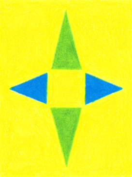
“Kuumba Background”
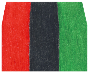
At one point, I had even begun considering an overhead view of a table all set for a karamu–complete with a choice of foods and other items–to be used, perhaps, with photos of family members. However, with everything else to do, this seemingly-natural analog to the table setting and symbols just seemed too much more to do without much benefit or use. In the end then, this all gave way to the sixth night-inspired fourth background; namely, the abstract in Pan-African colors (or “Kuumba Background”, as I came to call it).
Creating It All
Ultimately then, I finished up the drawings themselves within three weeks or so … no more than a little over a full month. Then came the other three or so months of work. Of course I had to scan everything and apply the usual corrections (for instance, the scanner always washes colors out a bit, so I have to tweak them back); only now faced with the novel task of keeping these corrections consistent across so very many images. As the symbols and such had to have transparency around them–and in some cases within–there was the task of adding that–again with so many images–while keeping borders and edges sharp.
“Mkeka 2”
Also, as I came to think around this time that I should have tablecloths and walls and such in a few different colors (also for the banderas and kinaras, versions with gold in place of the usual black), I had to learn how to swap out colors with GIMP. (As altering colors like that is something I had never done, as it goes against the rule of keeping images as close to the original drawings as possible.) And, well, I had to assemble the Kente pattern digitally, and I had to learn how to change the perspective of an image so that the mkekas, for instance, could appear to be lying flat on the table. Also, the Nguzo Saba poster had to be assembled … and probably a few other things I am not even thinking of now.
Once the “canon” of images was complete, then came twin issues with getting everything onto a selection of appropriate products (upon uploading to Zazzle): one, the images themselves pre-formatted to be most convenient to use; and two, the items each pre-arranged with particular designs (to help demonstrate all the possibilities of the Kit). This all turned out to be by far the most tedious part of creating the Kit (even though I had originally feared the tweaking and cleaning up of the images the most … not to mention some of the digital manipulations I knew I would have to do–manipulations of types I had never previously done with GIMP).
“Stories”
But even that was not all yet. I soon began to realize that with so very many images, I would really need to create an image catalog to post on this site … to help make clear what all was available to create with. And, later, I began to realize that I really needed to do some walk-through videos as well … to really show how to work with everything in Zazzle’s design interface. (Which, as I did not want to pay for WordPress’s premium plans, meant creating a YouTube channel … not to mention buying a USB microphone headset, and doing some practice runs with screen recordings.)
Lastly, of course there were all the little things … like writing the product descriptions; creating the actual Zazzle collection; setting up the YouTube channel; proofreading and double-checking everything (including the writing and setup of the image catalog); and just coordinating and launching everything across Zazzle, this site, the YouTube channel, and the Pinterest profile.
Really, even as the end got nearer and nearer … so it seemed the work just kept growing and growing. It began to feel like there would always be something yet to complete. But–steadily working day after day–of course as it had to, finally, everything was ready for launch … and here I now sit, typing up this recounting of it all! (While occasionally enjoying some Kwanzaa songs from YouTube, such at the following:)
Ujamaa and Cultural Considerations
From the start and throughout the months, one other issue often loomed large; namely, whether it was appropriate for me to create something to sell for Kwanzaa … and, if so, how to properly and respectfully go about doing it. Like I said, I had long since decided against doing a single drawing–unchanging and invariant across several products. Kwanzaa is just too non-commercial for that. (It is even customary to create many items oneself, for instance, rather than purchase them from elsewhere; though I suppose this may be true for the zawadi a bit more than other things.) Again though, with the idea of doing several drawings and creating an entire “kit”–whereby individual family members could all get involved and share in the creativity of making an item all their own–this aspect at least, I felt, was solved.
But …. Did that truly settle the commercialization issue? And … what about the fact that I would, after all, be putting products up for sale? That the fourth Principle of Kwanzaa–Ujamaa, or Cooperative Economics–specifically calls for supporting black-owned businesses? (Again, I am not of African descent or origin; and ditto, perhaps, for many of the individual Makers of the items available from Zazzle. Nor is Zazzle proper black-owned–although at the time of this writing, their Chief Fulfillment Officer, Charles Ohiaeri, is black. According to their “About Us” page, he has been with the company since before it was even started, and even more, he “built the architecture and technology that allows the company to produce millions of unique products from invitations to skateboards, most in less than 24 hours”.)
Well, as to my finishing thoughts on the commercialization issue, it eventually occurred to me that I am simply an individual, and no more. I do not have a slew of marketers, analyzing what would likely be most profitable to create. I do not have a team of artists and designers, professionally creating under directive of a management. (Again, with marketers strategizing how to best advertise and sell). Nor do I even have administrators or such to handle all the little tedious aspects of creating for Zazzle. It could even be plausibly argued–up to this point at least–that The Draw is much less a business for me, and much more a hobby.
Not to mention that items on Zazzle are not mass-produced. In fact, as Zazzle is a print-on-demand platform, items there do not even exist at all until–one at a time–they are ordered, manufactured, and sent out. So, while strictly speaking, yes, I would be creating comercially-available items … it came to seem to me that for nearly all practical purposes, no, that would not truly be the case.
As for the “compatibility” issue (with Ujamaa) … I took certain steps with it; though I grant it may never be fully settled. My original best idea was to give any profit I might make from the Kit to relevant charit(ies). That way, the benefits would go not to me, but in some sense to everyone for who Kwanzaa was created and intended.
But, there were various issues with this. For one, as I only get about 9.1% of the sale price for most items in my store, I knew it would be a long time before I would have enough to have anything of substance to give. Plus, how would I have kept transparency around it all, in a way that did not compromise my own privacy?
So instead … for all items in the Kwanzaa Creations Kit, I ended up setting my royalty rate to the minimum that I possibly could. (Which was to have been 0; only Zazzle would not allow that. So, 5% it had to be instead, which works out to be about 4.76% per item for me.) This way, the prices of all items in the Kit remain lower than all my other various items–meaning as much money as possible stays with the buyers of the the Gather ‘Round Kwanzaa Creation Kit’s items.
(And, if you are wondering how 10% becomes 9.1% and 5% means 4.76%, it is because Designers’ royalty rates apply to the base prices of items, rather than the final sale prices. For example, if the base price of at item is $20–that is, Zazzle’s price plus the Maker’s fee–then with a Designer’s royalty rate of 5%, we have $20 plus five percent of $20–which is $20 + $1 = $21–and so $21 for the actual sale price. Hence, $1/$20 = 5% for the royalty rate as based on the base price, but $1/$21 = 4.76% for the actual earnings from the sale price. Incidentally, in the interests of transparency, blank items–under “Create Your Own” on Zazzle’s site–show the base prices of items. So, comparing the price of a Designer’s item to that of Zazzle’s blank version, will reveal what royalty rate the Designer has set on said item. For example, if the blank version is $20 and the Designer’s is $21, then we have $21/$20 = 1.05; so 1.05 – 1.00 = 0.05, or 5% for the royalty rate.)
Now, as to whether or not this is all truly acceptable … I tend to think so. After all, Ujamaa does not forbid shopping at businesses and such owned by people of other races. And, while the small market for Kwanzaa perhaps makes it much more practical to shop for Kwanzaa items exclusively at black-owned businesses as opposed to more general things (what with the rise of big chains and online retailers and whatnot for so very many other items), still … perhaps a few exceptions are acceptable.
But note that I am not appealing to anyone to consider the Kwanzaa Creations Kit in violation of their own feelings or conscience on this matter. Everyone’s Kwanzaa celebrations are their own … as the second Principle–Kujichagulia, or Self-Determination–calls for. As I said earlier, this “compatibility” issue may never be fully settled. I can only say that I created the Gather ‘Round Kwanzaa Creations Kit with sincerity and heart … while everyone else knows how they and their own families feel about it. (The latter of which is the much more important of the two …)
Highlights from Along the Way
You already know the general steps of having created the Kwanzaa Creations Kit: drawing the images; scanning them in and correcting them as required; going further with some, as by changing perspectives on the mkekas or swapping out colors for the banderas and kinaras; and assembling the Kente pattern and the Nguzo Saba poster and such. Then, uploading everything to Zazzle and setting up select pre-arranged items; writing the image catalog for this site; creating the YouTube channel; and finishing off with product descriptions, the actual Zazzle collection, and coordinating the actual launching of everything. But, to take a closer look at many of these steps …
The Drawings
“Vibunzi 1”
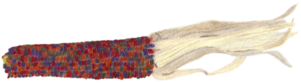
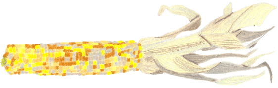
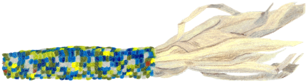
I have of course done photorealistic drawings in the past; though they are not my focus. With the Kit though, the bulk of what I had to draw was, of course, photorealistic. (Well, I could have chosen otherwise … except I did not.) One consequence of this was that I relied upon photo models to a much greater extent than usual. I recall, for instance, searching Google Photos for various fruits, kinaras, mkekas, Indian corns, djembes, and such–plus searches in general for sites with photos of such items. In at least one case, I even used physical items as models; namely, Indian corn for the vibunzi (but note that how they appear here is not quite how I had them arranged when modeling them–particularly the shucks):

The corn I used as models for the vibunzi, shucks included.

A closer view of the vibunzi models.

“Red Table”
“Vibunzi 3 Rev”
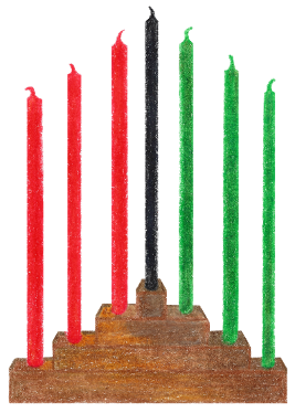
I also had to pay a lot more attention than usual to perspective. To get the sense of looking at / slightly down on a table setting, for instance, I drew the table with the whole top visible, and sides slanted slightly inward. But then of course, I had to make sure that the various symbols would look as though they were sitting on such a table. For some–like the vibunzi or mazao even–there was really nothing to do differently, while for others–like the mkekas–the real work in this regard would come later … as digital manipulations with GIMP. Others though–like the kinaras especially–had to be drawn to perspective to begin with. Here, for instance, in the unaltered scan of the three kinaras, you can see a bit of prep work in which I practiced making the kinaras appear as though seen a bit forward and from above (plus measurement marks and color samples and such):

Initial scan of the three kinaras.
Lastly, while improvements / advances to my drawing techniques have not been limited to the Kwanzaa Creations Kit, again due to its photorealistic nature, for instance I made an extra effort to use three or four shades per color in many cases. The kinaras are meant to appear as though made of wood (as are the djembe and the kikombe cha umojas, incidentally); even in the unaltered scan above, you may notice the varying shades (particularly apparent in the first and third kinara).
“Kinara 1”
“Kinara 3”
But even for objects meant to appear as though one solid color (the mishumaa saba / seven candles, for instance), I still blended three or so similar shades together in drawing them. There is just something about using one single color that can come off as less-than-natural … less complex. Of course, the more uniform the color was meant to be, the more similar the shades I used, and the more balanced I blended them (whereas for the kinaras, for instance, I deliberately focused more distinct colors in certain spaces than others). And, again, particularly as colored pencil does not always lay down as uniformly as certain other mediums (paint, I would presume, for instance), using more than one closely-related shade can help mitigate that effect.
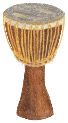
“Zawadi Djembe”
“Kikombe cha Umoja 2”
All About the Kente Pattern
Three drawings in particular of course merit special discussion: the Kente “squares” that together make up the Kente pattern. In terms of actually drawing, there is not much to add. Given that I sought fairly precise lines, angles, and symmetry and such, I did use traces (which I had created with Apple Pages). In fact, in two of the original documents below, you can even see a separate square or circle or such that I had used to help create the trace:

Created with Apple Pages, the trace used to draw the first square for the Kente pattern. You may notice the square that was in turn used to help create the trace itself.

The trace used to draw the second square for the Kente pattern, with the circle assisting in creating the trace itself. (Why four of the triangles are missing in this export, I do not know.)

The trace used to draw the final square for the Kente pattern. None of the lines were greyed in the form I used; why they are here, I do not know.
As the squares were simple to sketch beforehand, I also sketched out some ideas and drafts on my whiteboard (otherwise an unusual practice for my Zazzle work). In one of the photos below, you can also see repeating letters, which I used in deciding how to arrange the squares into the actual pattern (a bit more on this later):

Drafts for the Kente pattern, with notation for the arrangement of the individual squares at left.

A closer look at the drafts of the individual Kente squares.
The Considerations
Yet to circle back momentarily to artistic conceptions and cultural considerations …. How did I ever come up with the pattern, and, was it appropriate for me to do so? To address the latter first, of course I lack the profound experience of weaving Kente patterns, and even the deep knowledge of Kente in general. At best, I merely spent several hours reading about and looking at actual Kente patterns on the Web, so that I could hopefully create something acceptable. Indeed, I did read that it is often possible to discern the particular weaver based on the art, and that both traditional but also contemporary patterns now exist. (Though the page I believe I read this on no longer seems to be available, per my original bookmark; this page at least mentions that “A weaver’s choice of colors … may be dictated either by tradition or by individual aesthetic taste”, and that “Patterns and motifs are generally created by weavers who also assign … meanings to them”–two and four paragraphs up, respectively, from “Kente Samples/Designs”.) That told me that there is room for at least a little variation; and so, thinking how well a Kente pattern would go with the Kit, I went ahead and came up with one.
But is it appropriate? Well, if you wonder why I did not create a separate collection just for the Kente pattern …. Given my inherent lack of familiarity and heritage with Kente, I know other people can create much more authentic patterns than mine. So, I would leave that to them–keeping my own Kwanzaa-inspired pattern strictly as an option in the Kit.
Moreover though, I know that in Ghana, Kente is still very, very highly regarded–to the point that it is typically only worn for major life events like weddings, funerals, births, or the placement of new leaders or such. (This is presumably why in the United States and such, Kente stoles are popular at graduations.) I am not even sure that recurring holidays are truly appropriate occasions for it. Hence, to me, to just slap it onto a bunch of clothing and other items for everyday use or wear would be very distasteful–at best. Rather in consideration of these matters, I kept it strictly for an option within the Kwanzaa Creations Kit; which, given the effort I did put into it, feels about right … to me, at least.
The Meanings and Conceptions
In designing the Kente pattern, I obviously took inspiration from Kwanzaa itself; but I also read up on the meanings of different colors and shapes. Plus, I searched through images on the Web and specific sites, just to try and get a rudimentary feel of what Kente patterns in general look like. (Though I never considered trying any traditional motifs beyond deciding not to. One, I simply do not know such motifs well; and two, as Kwanzaa is barely 50 years old and with no specific links to Ghanian, Ashanti, or Ewe culture, traditional motifs would not be appropriate besides.)
Other than the squares themselves then, I also had to determine how I would arrange them into strips and such. You already saw the repeating letters that I used while deciding this. If, for instance, the strips were to each have two unique squares alternating (as seemed particularly common), then I notated that as
A B A B
B A B A
where A and B are the two unique squares; they alternate within a strip; and they also alternate across strips.
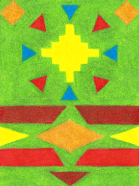
As you might see, I had lots of options to consider … but these in turn depended in large part on how many unique squares I wanted to do. Of course, I wanted the squares and hence the pattern as a whole to represent Kwanzaa in some ways …. Somehow, along the creative process, I settled on three: one for the contributions of all who came before us; another for the hope of a better tomorrow, through various hardships and the oscillations of peace and struggle; and, lastly, just a general representation of one’s life to live:
“Kente 1”
“Kente 2”

“Kente 3”
All to be arranged as:
B C B C
C A C A
(Feel free to read more about the meanings of different colors and shapes in Kente–as edited by Azizi Powell of Pancocojams here, and by Dr. Y of afrolegends.com here. Such sources were of great help to me in determining how I wanted to use color.)

“Kente 1”
For the first (which officially became the second), I thought about how Kwanzaa honors one’s ancestors and all their help and contributions. While the sentiment is part of the “fabric” of Kwanzaa, you might say (even given the emphasis on one’s family and elders in the present, and indeed the whole community), no more directly is it practiced than in the pouring of libations on the sixth night. The libation statement itself mentions and honors both personal and community ancestors (in general; there is no one “correct” libation statement above all others though), with the pouring of the libations themselves typically done in the four cardinal directions.
I also read that whereas yellow symbolizes preciousness and wealth (including spiritual wealth), blue can represent wisdom, while green can mean growth. In terms of meaning (of course meaning!), this all sounded wonderful for portraying the reverence and recognition of one’s ancestors and all they gave and did. And, as inspired by the pouring of libations in the cardinal directions, not only did triangles serve as arrows of sorts, but, in fact, as they are said to be representative of a person’s life–of “completeness”–they seemed suited to the completed work of one’s (deceased) ancestors as well. Hence for the first square, triangles in blue and green pointing in the four cardinal directions all upon yellow, it had to be.

“Kente 2”
For the second square (which officially became the third), I was thinking more about the “promise” of Kwanzaa–of dreams for a better tomorrow (and generation)–as particularly conveyed in Nia, Kuumba, and Imani. We all hope at least that the struggles and bloodshed of yesteryear will give way to peace and community in the future; and it is this process which I sought for the second square to embody. As such, at one end is a yellow diamond-like shape, for goodness and light we may all hope to reach. And surrounding that are red and blue–as like a circle–for the moments of harmony amongst the moments of fight … the ongoing cycle.
And then the other end seems to be one of barriers … particularly of prominent red for fighting and bloodshed, but also of brown for healing. Yet even there, an extra-decorative gold diamond in center underlies the sacredness of life, and the duality of both struggle and renewal. Taken all together then, the second square signifies the way to a brighter future in the duality of struggle and healing–of bloodshed and harmony across seemingly-infinite cycles of peaceful and harmonious times with those of fighting and bloodshed–yet also the sacredness of life, and the goodness we may all hope to reach … and for ourselves and our communities to become.

“Kente 3”
For the third and final square (which officially became the first, and the predominate one in the final pattern for its generality / comprehensiveness) …. Well, what is Kwanzaa fundamentally about? Certainly it is about heritage and history; family and community; introspection and improvement; knowledge and culture; and all that. But at a very basic level, what are all those things about? I might say, simply, life … hopefully a path toward goodness with many periods of harmony, yet also much growth and struggle; healing and joy; and, of course, mystery and darkness.
Hence as the most generalized / comprehensive square for Kwanzaa itself and for all of one’s life, lines portray the “flow” of one’s life (while adopting the angular look that many Kente patterns have). Blue predominates in the background for the periods of harmony, with green and red lines, respectively, for all the growth and struggle; plus more red and green, and then silver for joy; brown for healing; and black for darkness, all bound closely together. (In the far corners, white for spirituality and yellow for divine goodness round off the design, even as the central line is one of gold … for the sacredness of all of one’s life.)
And so there you have it–the finished pattern:
“Kente Pattern v1”
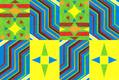
(Actually, I made no less than eight variations available in the Kit …. The differences are merely how the squares are oriented–flipped vertically or horizontally for the second or third, as the first is symmetrical about its center–and how they are arranged: with either two or three squares present and alternating in each row. These are minor differences, to be sure; yet in the interest of maximum customizability, I thought it worthwhile to do.)

“Kente Pattern v2”

“Kente Pattern v4”
Digitizing Everything
Usually, digitizing my drawings is not particularly difficult. With a lone image, for example, I merely scan it in using Preview (a built-in macOS application for viewing and working with images and PDF documents and such), and then make a few tweaks with GIMP. Each tweak is only meant to restore the image to how it appears on paper–to the best of my ability–and includes things like boosting the vibrancy of the colors (boosting the saturation); adjusting the overall lightness of sorts (adjusting the “levels”; done appropriately, this works as though removing a film from the image); and ever-so-slightly shifting how orange, brown, and red appear … and occasionally other colors (in particular, my scanner / software always distorts oranges and such a bit). (If you are curious as to how GIMP is used for these tasks, saturation and hue are adjusted with “Hue-Saturation…” from the Colors menu–“Master” for the overall saturation / color balance, “Red” for just the reds, oranges, and browns and such–while levels are adjusted with “Levels” from the Colors menu. See the online GIMP documentation for more details.)
The last sample I did, as doing these samples was more for fun amongst tedious work than actual, practical use.
The first “sample” I made to see how customizing the choice of images could look.

A second sample I put together.
With the Kwanzaa Creations Kit though, I faced a lot more … including a few rather-novel challenges. First (though not unlike what I have had to do with previous images), I needed to replace the backgrounds of many images with transparency (the original backgrounds simply being the white of the paper I had drawn the images on) so that new backgrounds would show around and through them (between the mishumaa saba of the kinaras, for instance). Of course, even images that did not need transparency in the middle(s) still needed to be separated from the paper they had been drawn on … all while keeping their borders and edges sharp. Plus, for instance, I needed to assemble the individual Kente squares together and such, and design and assemble the Nguzo Saba poster. (And, naturally, all images had to be cropped to size–though this was quite easy to do in all cases.)

“Gather ‘Round Kwanzaa Creations” … or one possible creation using the Kit.
Not necessarily so easy were the more novel tasks I faced. Once I had decided to offer choices of table and wall colors and such, for instance, I knew I would have to shift the hues and/or lightnesses of my table and wall drawings to actually get those colors. But that much was easy–even if not something I had done before.
On the other hand though … how was I suppose to swap out black for gold, for instance, with the kinara and bandera variants? (Not least of all because black is arguably hue-less; meaning, adjusting the hue of a black image in GIMP will merely leave it black–not gold or any other such color.) And, as for making the mkekas appear to be laying flat on a table (even adjusting the perspective of the table itself, if necessary) … how was I supposed to accomplish that? (Was it even possible?) And … whereas the usual corrections are easy on a lone image, for all the images in the Kit, there was no assurance that the particular corrections best for one would be good for the many others. Yet if I were to determine the corrections for each image separately, there was no guarantee that the images would all come out visually-consistent. Such being the case … how was I supposed to adjust all the images with consistency?
Working Everything Out
Well … while these issues loomed on very early even as I was drawing everything–and I contemplated solutions from the beginning–the definitive fixes often came when the times themselves came for such fixes. As for the consistency issue with so very many images … well, have a look for yourself:

The “all-scan” of my pencil-and-paper drawings for the Kwanzaa Creations Kit (as opposed to any digital manipulations of these core images).
What that is, is an “all-scan” … every single unique drawing I had made for the Kit. After scanning each one in individually, I then pasted copies of them all together in one file. This way, I could try different corrections with the levels and saturation and such, and more or less see how it was affecting the images collectively … which of course neatly solved the issue of maintaining consistency of corrections across so many images. (My only fear with this approach had been that the “all-scan” file would be too large to manipulate … for large images do take processing power and time to change; not least of all when just trying several changes. Indeed, though I do not recall for sure, I imagine I scaled the images down before conglomerating them.) Ultimately then, I only had to apply the appropriate corrections to each of the actual, full-sized images–once I had determined the appropriate corrections on the “all-scan” … and that concern at least had been taken care of.
Cleaning Everything Up

Initial scan of the three vibunzi.
As I said, cleaning the images up and adding transparency and such was never to be too hard or in doubt (beyond the consistency issue at least). Above, for instance, is the initial scan of the three vibunzi; here are the “polished”, final versions:
“Vibunzi 1”
“Vibunzi 2”
“Vibunzi 3”
You may notice the more vibrant colors; or that the orange is, well, more orange in the corrected “Vibunzi 2”. And, do you perceive a “film” or “cloudiness” over the initial, unaltered scan? The differences are not too drastic, to be sure (as they should not be–the scanner / software is not that terrible in capturing the images on paper); but are enough to be important nonetheless. Believe it or not, for the vibinzi and all the other images (save for rectangular ones like the backgrounds or banderas), I used the Eraser Tool in GIMP–zoomed way, way in–to erase to white all around and up close to all the edges. (For the wide open spaces, I simply used the Eraser Tool in much broader, larger strokes, and closer to a standard zoom level at that.)
Then–having done the painstaking work of carefully “crafting” the edges for a given image–I selected all the white using the Fuzzy Select Tool (experimenting with different “thresholds”, or, similarities in color for selection), after which I inverted the selection such that only the cleaned-up image itself was selected. Then, it was just a matter of copying and pasting that in a new blank image file against transparency … and, for image after image, that was that. (Tedious, to be sure; but at least obvious and simple. And, of course, if a given image needed transparency in the center somewhere–as all three of the vibunzi did: within the shucks–then it was simply a matter of adding up selections of white to one single selection before inverting, copying, and pasting.)
(Actually, the vibunzi presented a more complex case than all the other images though in that the colors of the shucks were too close to white for the Fuzzy Select Tool to make a good selection. Indeed, no matter what setting I used for the threshold, the vibunzi came off with “holes” and “chips” around the edges of the shucks. To deal with this, in addition to using antialiasing as I had for all the images–a technique / setting for “smoothing” a selection’s edge with several close shades of the relevant colors–for the vibunzi, I also opted to use feathering. Feathering–which is a bit tedious in that it needs a radius setting to specify how far into the image from a selection to operate–“blurs” edges by making them slightly transparent the nearer you get to an edge. So, while I did not need to feather for all the images, again because for the vibunzi, the shucks were so close to the white of the background, I had to find a balance between the selection threshold–and then the feathering radius–in order to get them appearing decently.)
Swapping Colors …
Now to the more novel stuff, changing the hue(s) of an image was at least pretty straightforward, even though not something I had done before. Consider for instance the table (digitally-tweaked but otherwise original), plus a couple of its variants:
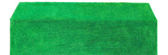
“Green Table”

“Black Table”

“Blue Table”
Or, consider the original wall and some of its variants:
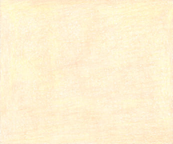
“Peach Wall”

“Grey Wall”

“Fuchsia Wall”
Again, only the green table and the peach wall are originally as drawn (minus the basic digital tweaks). From them, all the others (even a couple beyond what you see here) were created with GIMP. (In particular if you are curious, by going to “Hue/Saturation…” under the Colors menu; leaving “Master” set; and then adjusting the “Hue” slider. Pretty simple, and notice how this procedure maintains differences in shade–the images in whole change colors, leaving gradations in shade intact.)
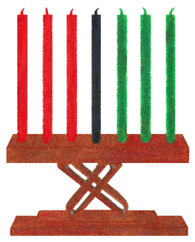
But now for the truly challenging …. I noticed early on (through YouTube videos and such) that some people use a gold candle in place of the traditional black. (Gold is, after all, considered a Pan-African color too … representative of the spiritual wealth of the people, peace, and harmony.) So, I felt that the option to do that with the Kit was a good one to have.
Unfortunately, as I said before, black (white and grey too) is essentially hue-less, so adjusting the hue of a black image will not work. (And, if you question the notion of black and white and such being hue-less, while in everyday life the terms “color” and “hue” are used interchangeably, in fact, technically, “color” is the combination of “hue”, “lightness”, and “saturation”. To desaturate a color entirely, for instance–to remove all vibrancy and make it as dull as can be–is to create a shade of grey; only changes in lightness will make it a darker or lighter grey–all the way to black or white–while changes in hue will produce no effect. Likewise, to darken a color entirely–any color–is to create black; again, adjusting the hue will make no difference at this point and nor the saturation even–whereas to entirely lighten and desaturate a color is to create white. The main point is: black, white, and grey can all three be of any hue you say they are, and are therefore “hue-less” … whereby changes in hue change nothing in appearance.)

“Kinara 2”

“Kinara 2 Gold Candle”
Hence, I clearly needed a different method to turn the black candles into gold. Upon further investigation, I discovered “Colour Exchange…” under the Map submenu of Colors. With it, I was able to specify a “From Colour”–using GIMP’s Color Picker Tool and a suitable sample radius, so as to average out varying shades in the black candles–and a “To Colour” … which ultimately made it pretty easy. (In fact, the only hitch was that especially for the first and third kinaras, no matter what thresholds I set for the “From Colour”, invariably some part of the kinara would change color to gold too. To deal with this, I had to zoom in real close and select strictly the candle–mostly using the Free Select Tool, but also the Ellipse Select Tool for the candles’ bases–so as to apply the color swap to the candles alone.)
And now consider the banderas–the original, plus a couple variants:
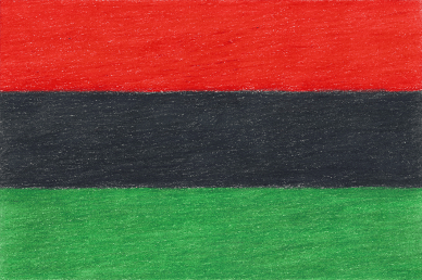
“Bandera v1”

“Bandera v2”

“Bandera v3”
You already now know how I changed the black strip into gold … but, how did I change the orders of the strips? (And why? Because the Pan-African flag is red, black, and green; whereas the Kwanzaa colors are given as black, red, and green. Banderas with either order are used. Meanwhile, as inspired by Ethiopia, the flags of a great many African nations use green, gold, and red … whereby rotating gives red, gold, and green. Remember: Zazzle makes it possibly to rotate images 180, 90, or however many degrees one wishes.)
Well, as I recall (and a bit in anticipation of the next section), I simply used the Rectangle Select Tool to copy, in turn, each of the three strips into a new image file of the same dimensions. In particular, by dragging only the top border each time, I was able to keep the divisions between the colors intact (that is, the bottom border stayed put each time–as it had been for selecting the previous strip). (More or less; if you look closely, you may notice just a tiny bit of “mix”.)
… and Changing Perspectives
But now consider this:

“Mkeka Background 1”

“Mkeka 1”
Or this:

“Kente Spread”
This:

Initial scan of the two zawadi.

“Zawadi Book Standing”
Or even this:
“Bandera v1”
“Draped Bandera v1”
What all the derived images here have in common is a change in perspective; all or part of them appear to be laying down flat. (And, really, I must say the effect is amazing to behold, is it not? Well, and of course I started with the banderas being rotated 90 degrees counterclockwise–not horizontal as seen here. And, the book was technically already flat; it just needed its “flatness” altered a bit so as to match the slope of the table.) This was yet another thing I had originally feared for–knowing as I did that I absolutely had to get the mkekas suitable for laying on the table; whereas the draped banderas were a good idea, and the notion of the Kente spread came last.
Again, I had absolutely no idea whether such as effect was possible with GIMP–though I soon found out about “Perspective” under the Transform Tools submenu of the Tools menu. With it, GIMP will let you select all of an image or just some rectangular portion, after which you can drag any of the four corners so as to distort the image from what it was. There is no option to objectively specify the changes; it must all be done by eye, basically. Moreover, in my case, given that I needed to make everything fit to the table, there was a lot of trial and error in getting the mkekas sized “just right” … plus only portions of the banderas and Kente pattern changed, and changed so as to align with the slanted sides of the table and such.
“Gather ‘Round Kwanzaa Creations” … or one possible creation using the Kit. Shown again here to highlight the Kente spread and mkeka together on the table.
(Actually, I may have made it more difficult than it had to be. I seem to recall that I temporarily included the table in each image I needed to adjust–though this led to canvas area problems, if I recall correctly–so that I could indeed adjust the perspectives relative to the table, after which I removed the table and re-sized everything else … or just copied the adjusted image to a new file. But I seem to recall as well that for the Kente pattern and banderas, I copied just the portion I wanted to change in each case, and then pasted it as a separate layer to adjust–“layers” being distinct portions of a single image–after which I erased the then-showing but obsolete portion of the original layer, finally joining the two layers together as one. It appears to me now that I might have merely selected the portion of each image I needed to change; though regardless, that would not have obviated the need to match everything up with the table, and the canvas / sizing issues that arose with putting the table with the other images and such. It was simply not a “clean” or straightforward operation to complete; much less more than once. But in terms of quality … the results speak for themselves.)
All-New Digital Creations
Well … mostly new … or, at least, somewhat. You already saw the bandera variants in which the order of existing colors were swapped, for instance, plus the “Kente spread”. These were digital modifications of existing drawings … as are, for instance, the “Kente strips” (two of the four shown here):
“Left Kente Strip”

“Bottom Kente Strip”
Somewhere along the way, I figured that these could be used as borders, for instance, or else perhaps in other decorative ways. In fact, I even ended up using one in the Nguzo Saba poster:
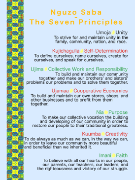
“Nguzo Saba Poster”
Of course, the actual Nguzo Saba poster in the Kit is completely customizable–just as with any item in the Kit. (The poster does not even have to be an Nguzo Saba one, if so desired.) Rather, this Nguzo Saba poster is for potential inclusion within any of the innumerable designs that the Kit enables. It is a fairly simple design (which I assembled in GIMP); but then, the Principles likewise have an elegant simplicity about them (in wording at least, even if not in meaning). Can you see subtle ways in which the design reflects the association between the Principles and the mishumaa saba and such?

My first attempt at the Nguzo Saba poster.

Another attempt at the Nguzo Saba poster.
And speaking of the mishumaa saba … these flames are not quite as they appear / were originally drawn either:

“Straight Wick Flame 3”

“Straight Wick Flame 2”

“Straight Wick Flame 1”

“Slight Right Wick Flame”

“Slight Left Wick Flame”

“Strong Right Wick Flame”

“Strong Left Wick Flame”
In fact, as you can see in various items in the Kit, they are slightly transparent. (Translucent? That is not a term I have seen used in reference to partial transparency … but it seems apt enough.) Why? So that just a bit of the underlying wicks would show through … given that flames are somewhat non-material in nature. And … how? If I am recalling correctly, for each flame, I simply adjusted the image / layer’s opacity down just a bit. (Another amazing effect in GIMP–and this time, a rather easy one to apply.)

“Custom Photo 1”

“Custom Photo 2”
Oh, and in anticipation perhaps of the following section, I should mention the photo / image placeholders as well. For the default designs, in cases where a photo seemed to be merited–yet such a photo was one I did not have anything specific for … like one’s family, for instance–then I used either of those two placeholders. (Zazzle makes it easy to swap in one’s own photo or image … or even to delete the placeholder in favor of nothing.) Naturally, I created them in GIMP … and other than choosing the text colors and just placing and sizing everything (the text; the image dimensions themselves; and so on) there is not much to say.
Curating the Celebrated Leaders Photos
Also … although not my own drawings (or drawings at all!), as I had envisioned items from the Kit featuring photos of famous and renowned civil rights leaders and such, I wanted to curate a few to include as part of the Kit. While Zazzle makes it easy to upload one’s own photos / images (meaning the selection of people is not limited to these particular photos–nor this group of people), still, I thought it would be nice for the Kit to come “pre-loaded” with a few. Besides, for the sake of demonstrating the possibilities via default designs across several items, I needed at least some of these photos for my own use anyway.
Marcus Garvey
Public Domain

Rosa Parks
Public Domain
Harriet Tubman
Public Domain
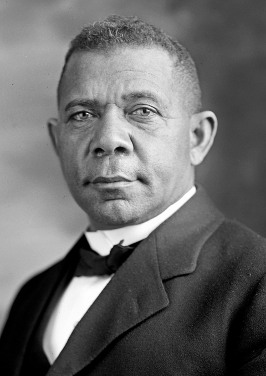
Booker T. Washington
Public Domain
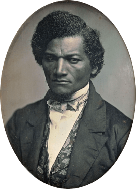
Frederick Douglass
Public Domain
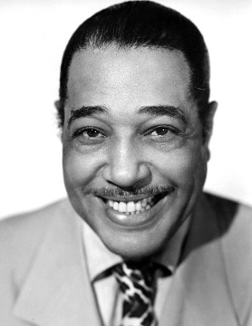
Duke Ellington
Public Domain
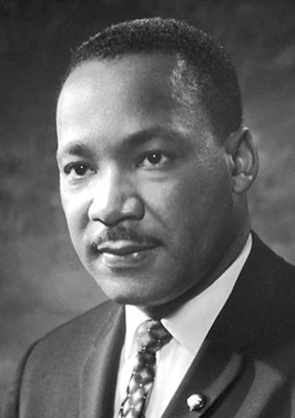
Martin Luther King Jr.
Public Domain
Of course, as images can only be used with permission (unless they are in the public domain / otherwise free of copyright), I had to search for images I could actually use. As such, a couple of these were a bit small (since my options were very limited), meaning I had to use GIMP to upsize them a bit. (Not nearly enough to hurt the quality; just enough to bring them all up to at least a decent size. Most likely, I was seeking a size so that the Zazzle design interface would not balk at maximizing them on all but the largest of items.)
Selecting the Leaders
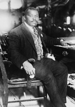
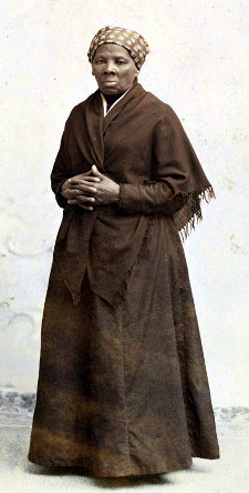
But … why did I settle on this particular group of people? I wanted to limit the number of photos I needed to find for defaults (again, Zazzle makes it easy to upload whatever photos / images one wants, if so desired), and with there being seven Principles … to feature just seven photos–one each of a person who exemplified a given Principle–seemed reasonable.
-
For his leadership and support of Pan-Africanism–at its core, a movement for solidarity among all people of African descent, no matter where in the world they may reside–Marcus Garvey seems a very good choice for Umoja, or Unity.

Marcus Garvey
Public DomainUmoja: To strive for and maintain unity in the community, family, nation, and race.
-
And who could forget Rosa Parks’s most iconic of moments, when she refused to give up her front-row seat to a white man? Although her strength and conviction qualify her for any number of the Principles, certainly Kujichagulia, or Self-Determination fits.

Rosa Parks
Public DomainKujichagulia: To define ourselves, name ourselves, create for ourselves, and speak for ourselves.
-
Ujima, or Collective Work and Responsibility …. It takes some effort to assist others with their struggles; and rather a certain courage … when the work is as risky as helping slaves on their way to freedom. For her “conductance” of the Underground Railroad, Ujima it is.

Harriet Tubman
Public DomainUjima: To build and maintain our community together and make our brothers’ and sisters’ problems our problems and to solve them together.
-
Perhaps less recognized than others these days, Booker T. Washington’s advocacy for businesses, entrepreneurship, and economic strength readily match him with Ujamaa, or Cooperative Economics. He also advocated for education, feeling the pride that can come from work and school was as important for people as anything else.

Booker T. Washington
Public DomainUjamaa: To build and maintain our own stores, shops, and other businesses and to profit from them together.
-
Frederick Douglass …. Quite a name–and figure–across American history. Including his most famous slave narrative, once he had taught himself to read and succeeded at last in securing his freedom, he went on to write and speak, oh so eloquently, for abolitionism; the realities of slavery; and well beyond in support of women’s suffrage even. With such never-ending work, clearly, he had Nia, or Purpose.

Frederick Douglass
Public DomainNia: To make our collective vocation the building and developing of our community in order to restore our people to their traditional greatness.
-
Kuumba, or Creativity. Associated with art and culture as it is, Duke Ellington was a true master. In leading his orchestra–and personally writing hundreds of compositions–he took jazz to an equal place amongst more traditional music … and thereby gave America its own original art music genre (or “classical” genre, as people say). What a big way to add beauty to life!

Duke Ellington
Public DomainKuumba: To do always as much as we can, in the way we can, to leave our community more beautiful and beneficial than we inherited it.
-
And Martin Luther King Jr. … Dr. King. His Dream will never be forgotten, but always remembered. No longer to be judged by the color of one’s skin; but rather the content of one’s character. And what character indeed, in Dr. King’s case. Dreaming of the true America where people of all races stand shoulder-to-shoulder as equals, he held–and so inspired–Imani, or Deep Faith, as only the best do.

Martin Luther King Jr.
Public DomainImani: To believe with all our hearts in our people, our parents, our teachers, our leaders, and the righteousness and victory of our struggle.
… And All Then to Zazzle …
If everything I have recounted so far sounds time-consuming … of course it was! But the really time-consuming work–or was it merely so tedious?–came once all the images were ready to go. Uploading them all was not so bad; but adding every single one of them to each and every item was. That is, for every item I wanted to offer in the Kit, I had to first add each image to it one by one. And then … for each and every item, I first had to organize all the images (though I tried to handle this when I first added them), and then size or otherwise adjust them all. (For instance, just shrink them down, or else arrange certain ones in particular positions with others … such as getting it so that the tables would automatically be below the Kente spread, which would be right below the draped banderas; then the mkekas atop that, with the kinaras next; and so on and so on. Or, just putting the banderas up on the middle of the walls; or sizing the candle flames; or arranging all the symbols on the table and such.)
Of course, having the chance then to do the default designs for all the items was fun. And given that the Kit is meant to be so customizable … why did I do default designs (and put myself through all the tedium of sizing and placing everything beforehand)? Simply because I wanted to demonstrate some of the possibilities … of what all might be done with the Kit (even as I made everything as convenient as possible to change and otherwise work with; my own default designs would not have required such standardization or attention). In fact, virtually every item in the Kit has a complete table setting (whether visible or “hidden”); and, ideally, hiding some images while showing others will automatically produce a decent design (if the default is already a table setting, that is).
As to what the default designs are …. You can see for yourself by looking at the Gather ‘Round Kwanzaa Creations Kit. (Or, by watching the first ten minutes or so of the walk-through video below.) While I would like to think that my defaults are pretty nice, they are merely for demonstration purposes … not what the Kit is all about. (Though of course if you, your family, your friends, or whatnot happen to really like an item with its default design, that is fine; you can make as many or as few changes as you wish. After all, it is all about you and your family or such getting something that will hold special meaning for you all during the holiday.)
Of course, even this stage in creating the Kit presented some challenges of its own. Honestly, although I did look into the matter, I never actually confirmed that Zazzle’s design interface would accept 80+ images on any one item. (Not the best practice … to not verify something like that. It was just that I could not easily confirm it; even as I saw no evidence–and had no personal experience–to suggest otherwise.) Early on, I also thought of whether it would be at all convenient–let us even say … realistic–to expect people to work with so very many images on an item. (For although Zazzle makes it easy to “hide” unwanted images, still, depending on how high or low they appear in the list, some of the wanted images will nonetheless partially cover or even outright conceal others. Then, only by re-arranging them in the list–as be dragging-and-dropping–can you change which images appear to be on top of / in front of others.)
Yet, as I carefully considered the default order of the images, I came to realize that the need for rearranging them could be kept to a bare minimum … just by putting certain ones in certain places. (For instance, the backgrounds all at the bottom; the symbols above the tables and such; the mkekas below most all the other symbols; an so on and so on). Indeed, this is another reason why all the tedium of pre-arranging everything had to be done. (And, if you are particularly interested in what went into the pre-arranging and -formatting, here is another of my walk-through videos that covers such in great detail:)
Necessary Supplements and Nearing Completion
Perhaps, in the end, the toughest part of creating the Kit was, in some sense, just all the lingering things that had to be taken care of. As I mentioned before, it eventually became apparent to me that I would have to provide an image “catalog” of sorts–simply because there were just so very many images for people to work with. In that same vein, I finally even came to feel that some sort of walk-through video was in order as well … again, because whereas I, as a Designer, am very familiar with the Zazzle design interface, it could easily seem overwhelming to anyone less experienced. (And, after all, what point would there be in doing such a highly-customizable collection, if it were likely to overwhelm or otherwise intimidate people? I had to put forth the extra effort to take some simple steps to help prevent that from occurring; I simply had to.)
Of course, the image catalog but most especially the walk-through video ballooned into bigger and more time-consuming things than I might have imagined … and then there were simply all the little things that had to be completed. Things like writing the item descriptions; actually assembling all the items in the collection; crafting images for the collection header and icon; setting up a YouTube channel for the videos (yes, more than one in the end); and simply coordinating the launch of it all across Zazzle, this site, the Pinterest profile, and, of course, the new YouTube channel.
The Necessary Supplements …
For its own part, the image catalog was not so tricky to do. Of course, it was more than a matter of just gathering all the images on a page; I had to organize them all–obviously–yet also explain certain things about them, including different ways they might be used and such … even advice for using Zazzle’s design interface or whatnot. (Plus, there is always some prep work for uploading images to this site … and then a bit of a hassle in terms of displaying them. Fact is, whereas inserting a lone image in one place is quite easy, to display several in a row or in columns or whatnot requires some practical CSS markup–CSS being Cascading Style Sheets, which is a coding of sorts for controlling how Web pages appear and look.)
On the other hand, the videos were substantially more involved. I always figured they would be voiceovers of me working with the Kit; yet I still had to determine what exactly I was going to cover / do. Further, since I did not wish to pay more to WordPress just for the privilege of hosting private videos here, I soon realized I would need to create a YouTube channel instead. (WordPress does not charge anything to link to YouTube videos.) And, lastly, of course there was the issue of how, exactly, I was going to record the videos. As I readily found out, Apple’s QuickTime Player does screen recordings with optional voiceovers … but I still needed a new (USB) microphone, as Apple’s more recent computers do not readily work with traditional audio input jacks.
So, all in all, there was a bit more to do with the videos as opposed to the image catalog. In fact, as I should have expected, while I did make up an outline for each video–and even practiced what I was going to say away from the computer–still, my initial recordings did not go as planned. Naturally, “perfection” was too high a standard to aim for … but, for instance, I did an otherwise-satisfactory recording of the first video (of three), only to find that as I had apparently had the microphone too close to my mouth (the microphone being part of a headset), you could hear me expelling air occasionally as I talked.
That, for instance, just seemed a bit poor to me to run with, so as much as I did not want to, I had to re-record that video. And, frankly, I seem to recall that for whatever reason, I had to re-record the second one too. And, whereas the first was the overview and basic customization options–and the second was a very detailed covering of complete customization using the design interface–the need for the third only became apparent when I realized that I had not covered a few things in the first two videos. (Yet for all that … are the videos too long? I honestly am not sure …):
Lastly, while minor coordinations would have to be done with the YouTube channel–just as they would for every other platform–still, I had to go through the process of familiarizing myself with a new platform, and getting all the little settings and such properly set. Again, I am not referring to simply getting the videos up or set up, nor anything I would have to coordinate with other platforms later on; I mean the very core of setting up and becoming familiar with a new (to me) platform. (And, if you are interested in what The Draw’s YouTube channel may or may not ever become, I have a brief write-up of that here.)
… and Nearing Completion
Finally then, as I finished with the image catalog and walk-throughs / YouTube channel … at last, all that remained were the truly little things. Again, writing descriptions for all the items in the Kit; deciding how to arrange the items in the actual collection; prepping and uploading images to this site and to the Pinterest profile; and so on and so on. Again, the collection itself also required header and icon images, so I created suitable forms in GIMP (plus its own description and such, apart from those of the individual items).
And … just coordinating everything across all the platforms. For instance, trying to “launch” / publicize everything as close together as possible, and ensuring plenty of cross-links and such. By this late time in the process–especially knowing that the walk-throughs were even done–I could begin to rest easily. And so–save for this recounting that I am still finishing–after about four months of near-daily, hours a day work … it was all about to end … as everything was nearly ready to go “live”.
Materials and Meanings
“Mkeka 2”
Go “live” … yet to what end? Would anyone even be interested in the Gather ‘Round Kwanzaa Creations Kit? What truly is it, exactly, anyway?

“Kikombe cha Umoja 2”
That last question may seem a bit odd. After all, the Kwanzaa Creations Kit is a collection of items on Zazzle, each of which may be fully customized for maximum personal meaning. But, ah, that is precisely the thing … “personal meaning”. Kwanzaa is a highly introspective, personal holiday … and it is not commercial. Whereas the Kit is available on quite a commercial platform. Given that … what is the Kit, exactly?

“Kinara 1”
Well … we all rely on material objects and symbols and such, it seems, to reinforce what we feel inside … and to help us share, with others, what is so very dear to our own hearts. I, for instance, am reminded of growing up celebrating Christmas … with attention given to Santa Claus; The Night Before Christmas; and Rudolph the Red-Nosed Reindeer and such. I suppose Santa is a legend that spans centuries … while The Night Before Christmas, it fact, was originally only published anonymously.
“Vibunzi 2”
But Rudolph, for instance, was quite a deliberate, commercial attempt at cashing in on the holiday. Not that everyone who created or extended it, it seems–the original story; the cartoon; various books; later the song and such–lacked the spirit of the holiday. (It is, of course, very difficult to know what anyone truly feels in their own heart … much less people who lived decades or so previously.) But, considering that it was a big marketing point for Montgomery Ward department store in 1939 (the whole reason anyone even thought of it at all) … some executive there definitely had a very commercial aim in mind.

“Mazao 2”
Still … these certain things I grew up with were more on the commercial side, yes (or else became so as years went on) … only as a child, I never realized that. To me, they were only ever a part of the magic and wonder … and ways my parents and family shared that magic with me. (I was actually quite surprised–just within the past few years–to realize that various parts of Christmas like Rudolph, “Jingle Bells”, The Night Before Christmas, and such were at one time brand new and even perhaps commercially created or not even originally associated with Christmas–rather than things that had always been there. And if this sounds at all silly … that is how a young child may perceive things; things they may never even research or look back into as an older child or adult.)

“Zawadi Book”
And so, perhaps … therein lies the secret to overcoming commercialization. Maybe the ills of commercialization need not automatically affect us; rather they may only taint the hearts of those who would exploit–without abandon–special days for commercial gain. All of us can instead filter through what could become meaningful to ourselves; even as we discard or outright ignore all the rest. Ourselves, our families, and our children can always come away only with enriched meaning … leaving the profiteers with little to treasure in their own hearts.
(In other words, perhaps … it is not that of which they present you that affects; but only rather that which you joyously receive in your own heart.)

“Zawadi Djembe”
The Gather ‘Round Kwanzaa Creations Kit is, then, that which could become very special to you and your family for Kwanzaa … or perhaps not at all. In the spirit of Kujichagulia, you get to settle that; even as I remain comfortable in my own motivations for having created it. Yet if it could mean something to you and your family … then I sincerely hope it does; that an item from the Kit becomes just one more thing to make Kwanzaa all the more special and so very meaningful for all of you.

“Nguzo Saba Poster”
And on that note (no pun intended!), I would like to close with one more song. A song based around the symbols might not sound so inspired (but then, Kwanzaa music is still in its infancy, I think … despite how good the songs in this very post have been!); yet the way the singers do it, you can just feel–particularly as the verses go on–how special and so very meaningful Kwanzaa is to them.
“(Let) Each one, teach one … about the symbols of Kwanzaa. (Let) Each one, reach one … get the word, pass it on.”
Indeed.
“Bandera v1”
