Drawing for a New Day

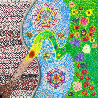
I first heard of Nowruz about three years ago, from a classmate who was kind enough to bring some cookies to class in celebration and observance of it. For those of you as yet unaware of Nowruz, it is a 3000+ year-old holiday that, at least as I best understand it, celebrates the arrival of spring, and the renewal not only of nature, but of one’s health and fortunes and such as well. Though it emerged with Zoroastrianism, for which it remains a holy day (as it does for certain other faiths as well), today, it is largely a secular holiday–most notably enjoyed by Iranians worldwide, but by many other peoples from Western Asia and the Middle East as well.

Maybe it was because of my general interest in holidays that I became inspired to draw something in honor of Nowruz (also known as the Iranian New Year or Persian New Year, and alternatively spelled Nowrooz, Nourooz, Nauruz, and so on). Certainly, that I occasionally draw for select holidays played a role, and being so secular and, might I say, universal, perhaps it was simply a natural choice. Throughout the process, I found myself thinking of Nowruz celebrants I once knew as well, including my aforementioned classmate.

Whatever my underlying motivations (and sometimes, with art, one’s motivations remain as special mysteries), “Nowruz” not only took a lot of time to actually draw, but quite some time to fully conceive of as well. I can only hope that it does justice to the holiday; a time that holds such deep, rich meaning for so many people, yet one so widely celebrated and secular as well.

Nowruz, colored pencil drawing by Darren Olsen at The Draw

“Nowruz”
© 2017 Darren Olsen

Continue reading …

Advertisement

When Policies Change: Writing Product Descriptions

Full control over projects and enterprises is always nice, particularly creative projects. Or at least, it always feels nice. A nice thing about Zazzle then (and presumably other print-on-demand companies), is that Designers have full creative control over their work. Sure, Zazzle does have a few restrictions for art and photos (for instance, nothing that can reasonably viewed as discriminatory, nor anything that encourages drug abuse, is excessively violent, nor obscene or pornographic in a non-artistic way), but in all reasonable and understandable ways, Designers are free to create whatever they want. Of course, this extends to whichever products to post as well, plus, how to organize and present them.

Yet one is always well-advised to re-evaluate their work and practices at times, and as with being part of any community undertaking, overseen and managed by a third party, sometimes, Zazzle makes changes that encourage, or even force, Designers to react. Zazzle does these things, of course, not only in their own best interests, but those also, ultimately, of their Makers and Designers. And while such changes can understandably be frustrating at times (and granted, not all changes will directly benefit all Designers), taking time to adjust to and occasionally limiting what one can choose to do, if nothing else, they are, again, simply a part of creating and selling in conjunction with a company.

Continue reading …

Creating Ms. Deal

When I create artwork to be placed on Zazzle products, usually it is simply that: I draw a picture, scan it, tweak it ever-so-slightly, and begin placing it on a range of products. When I came up with the idea of Ms. Deal though, it all became a true project, with evolving concepts and multiple parts required for completion. What started as an idea for a can / bottle cooler only, eventually became several distinct drawings, mixed-and-matched on a small collection of products, and even a “backstory” for the products in question! Even my Star Back Playing Cards Set, which took a lot of thought and effort to bring to completion, was not nearly as expansive as the Ms. Deal project.

Ms. Deal - Assembled, colored pencil drawings by Darren Olsen at The Draw

“Ms. Deal” – Assembled
© 2016 Darren Olsen

Continue reading …

Remembering Ms. Deal

For my “Ms. Deal Progressive Nostalgia Soda Set“, a collection of products centered around a vintage-modern soda, here is the (fictional) backstory of Ms. Deal: the soda, the woman, the history, and the hope. Enjoy.

The story of Ms. Deal, if only a footnote, is nonetheless an interesting one. It begins in 1883 in Seneca Falls, New York, when the woman named Patty Fallow was born. Patty’s parents owned and ran a corner drugstore, which, like most drugstores of the time, served all manner of sweets and drinks. Young Patty was quite fond of these things, though her favorites were the various sodas of the era. Indeed, she loved little more than a good soda, and was always eager to try out the newest creation of some local fountain, even as she helped out at her family’s own. An inquisitive and clever child, perhaps it was only a matter of time before she invented her own unique version.

Continue reading …

Placing Images for Changing Products

When placing an image on a product, it would be nice if its appearance remained consistent across different forms of the product. In particular, when placing an image on one shape or style of a product, if it still looked good on all the other ones. After all, no Zazzler wants customers to select a certain form of a product, only to be met with a less-than-good appearance of an image or, worse, empty space. Yet placing images for consistency of appearance can be a bit of a challenge. Not only can Makers offer new forms or styles of existing products, ones which have different design dimensions, but sometimes, just getting an image to look good on all the existing options can be problematic.

Designing for Zazzle thus requires some careful thought on how to go about placing images, at least if they are intended to fill all the design area of a product. (Note that the design area includes the safe area, guaranteed to remain on the finished product; a border which may or may not get cropped during printing; and a bleed area which is supposed to get cut, except not assuredly.) Obviously the shape of an image plays a big role, as does the precise placement, with centered, square images seemingly being the safest to work with. Aspect ratio and precise placement aside though, in my experience, it is usually just a matter of fully expanding the image on all the different forms of a product in turn, and then checking on all the others to see how things look. Appearance can then be optimized for all current forms, at least, simply by working on the “right” one to begin with.

Continue reading …

“Moonlit Dreams” and Product Inspirations

One basic approach to selling on Zazzle, is simply to put a drawing or other work on as many products as possible. That way, the effort of producing a design is maximized in terms of the number of items added to one’s store, and, hence, to the Zazzle market place at large. Not everyone does this (for instance, some Zazzlers specialize in one product type only), but many do, including, usually, myself. And when a given design truly works fine on many different product types, it is not simply about adding more items at once; it is about offering people what one hopes are all good and worthy products.

Sometimes though, certain products in particular inspire a design, leading to “product inspired” designing in contrast to the “design first” way. This can be just one product in particular, and in fact, I have a “Few of a Kinds” category collection in my store for this very reason (well, more precisely, because I want to occasionally design for very specific items). Other times, this can rather be a subset of products, because the underlying inspiration, perhaps, is an intended use or purpose, one for which only certain products apply.

Moonlit Dreams, colored pencil drawing by Darren Olsen at The Draw

“Moonlit Dreams”
© 2015 Darren Olsen

It was for such a “purpose / product inspiration” that I drew, for instance, “Moonlit Dreams”. I was thinking of something to go on a nightlight in particular, and as nightlights are often useful to kids and babies, I decided on something suitable for a nursery. From there though, with a design so “baby” in nature, I soon saw how nice “Moonlit Dreams” could be on certain other products suited to nurseries, or, even, to some suitable for baby showers as well.

Continue reading …

Tricky Designing with “Star Back” Playing Cards

Most of my drawings to date have been fairly straightforward to complete, including the finalized, digital images they ultimately become. Not counting any thought given to a design beforehand, usually I just sit down and work on a drawing–really figuring out then and there precisely what it is that I want to do–and, I complete it, sometimes trying out particular techniques along the way. Perhaps then I end up spending, say, three to five hours on a drawing, or maybe more if I have to work on it into a second day. Then I just have to scan it and crop the resulting digital image, after which I go about posting products and writing descriptions and such. (The latter of which, granted, can be a time-consuming and even tedious process.)

When I decided to design a playing card back though, things got substantially more difficult (particularly for a first time around with such a project), and I needed to rely a bit more both on my image editing program, GIMP, but also on my ability to think up alternate methods for achieving my objectives. Whether it was how to ensure symmetry across halves or how to draw such fine and finely detailed lines, or, simply confronting unforeseen issues, creating my Star Back Playing Cards became a really long, but instructive, experience.

Continue reading …